

Venue AR Assistant
Augmented Reality (AR) is rapidly gaining in popularity. This technology has been used in different areas, such as Pokémon Go or virtual artworks in the museum, but not a lot of AR has reached event venues yet. Many people attend events held at public venues each year and some people often get frustrated while at these events so we wanted to create something that can help make the user’s event experience easier and more enjoyable.
During the ten weeks school quarter, our team have created an augmented reality app that allows people to switch between using 2D and AR modes to help them navigate around a venue and obtain more information regarding it.
ROLE
UX/UI Designer
Usability Researcher
TOOLS
Pen and Paper (Sketching)
Adobe XD (Prototype)
Adobe InDesign (Personas & User Flows)
Sketch (Sitemap)
TIME
10 Weeks
TEAM
Andrew Belmonte
Chris Cote
Shih-Yuan Yen
Qirui Zhao
PLATFORM
Mobile
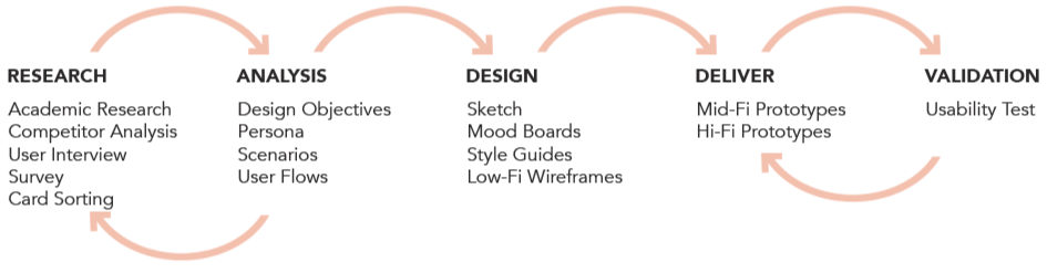
Process
Discover, Define, Develop, Deliver
Our team chose an iterative, non-linear design process, like conducted background research which included interview and a survey, built out a prototype for a mobile application that people would use while at an event held at a venue, and ran real usability tests to improve our design, make sure we have archived the design goals.
Research
Academic Research
Before we started, our team researched to find academic support for our hypothesis that selling event tickets is a big market, and not many ticket websites and apps use AR technology.
According to the research, the estimated concert ticket purchasing demographic is people ages 15-45 and the estimated sports ticket purchasing demographic is ages 18-65. Awareness of AR ranges between the 70-75% mark among the 16-44 age group but drops significantly among 45-54s (56%) and 55-64s (44%). (Buckle, 2018).
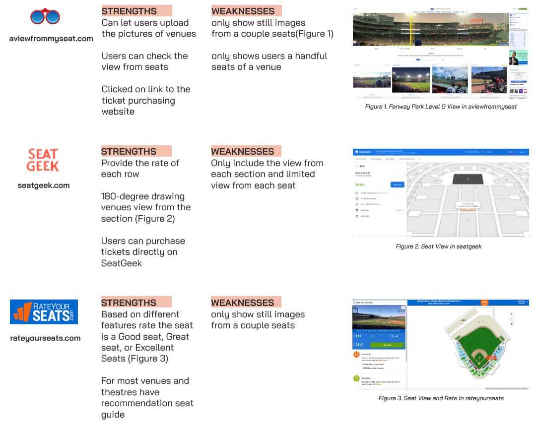
Competitor Analysis (By Qirui)
The goal of competitor analysis is to find out how our product is differentiated from other similar products.
During our competitor research phase, we found that Ticketmaster already has a view from your seat feature on their website which is something we wanted to do as our main feature. We thought that our idea was brand new and not already implemented on any ticket sites but we were wrong. Our team ended up going a step further though, rather than just showing the user a picture of their seat, we showed them a full panoramic view from their seat as well as all the amenities around them.
User Interview & Survey
Our group interviewed ten people in total (5 male & 5 female) from a different variety of age groups. We had six interviewees who were ages 24-28 and also four interviewees who were ages 41-46. We feel like having this variety in age helped give us a good background perspective from both younger and older users.
We built out our closed questions survey on SurveyMonkey and posted it to the discussion forum in class as well as on our school participant pool. In total, there were 27 people who took the survey and it was a good amount to go off of.
"Just having a view from their seat wouldn’t be enough for me to download an app for just that."
"If provided with more information, I would spend up to 30 mins doing my own research on a venue prior to an event."
" I'm looking for something that would save time and overall make the experience easier"
*Most people said that they haven’t used AR before but are super intrigued by it and would like to use it.
Card Sorting
To find out how the users think about our application’s information architecture, understand users' habits and cognition, and ensure that our menu hierarchy and availability of functionality are intuitive, we set up a closed card sort using Optimal Workshop.

Analysis
Design Objectives
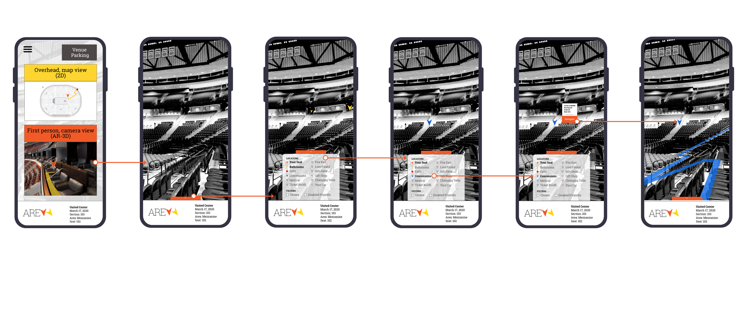
Provide users with an augmented reality-based application that will help to provide event venue information previous to the event.
Provide users with venue specific information during their event that will assist them in navigating their live experience.
Determine the difference between users’ needs for venue information prior to the event, as opposed to their needs during the event, in order to determine the necessary functionality.
Initial Functions:
View from seat
Bathroom locator
Find concessions
Expanded Functions from interview and survey:
Closest exit
Baby changing table
Locate my car
Medical help
Info desk
Event specific information
Persona (By Qirui)
Based on the design goals, we made two personas about two kinds of the main user to identify what functions and problems we should be aware of when designing.


Scenario & Journey Map (By Qirui)
We made a journey map for each of the personas we created. Using Adobe InDesign we created our journey maps to show the exact steps a user would go through when dealing with our product. The journey map shows the user’s expectations before and after using the app and also the emotion and actions they experience when using our product. Our journey map helped us uncover the highs and the lows of what we designed.


Design
Information Architecture
Based on the card sorting results, we created the sitemap to help us keep our design organized.

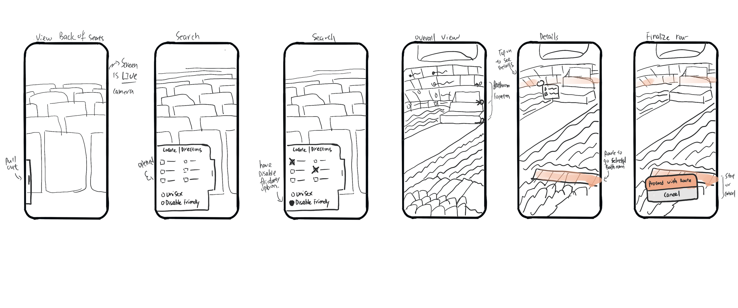
Low-Fidelity Wireframe Sketches
Based on the two tasks flow we sketched wireframes.
Task 1: a younger user to use our app to find parking space and navigation to her seat.
Task 2: an older user who is in a wheelchair and has to use our app to find an accessible way to his seat and also to a disability friendly restroom.

Branding

Prototype & Validation
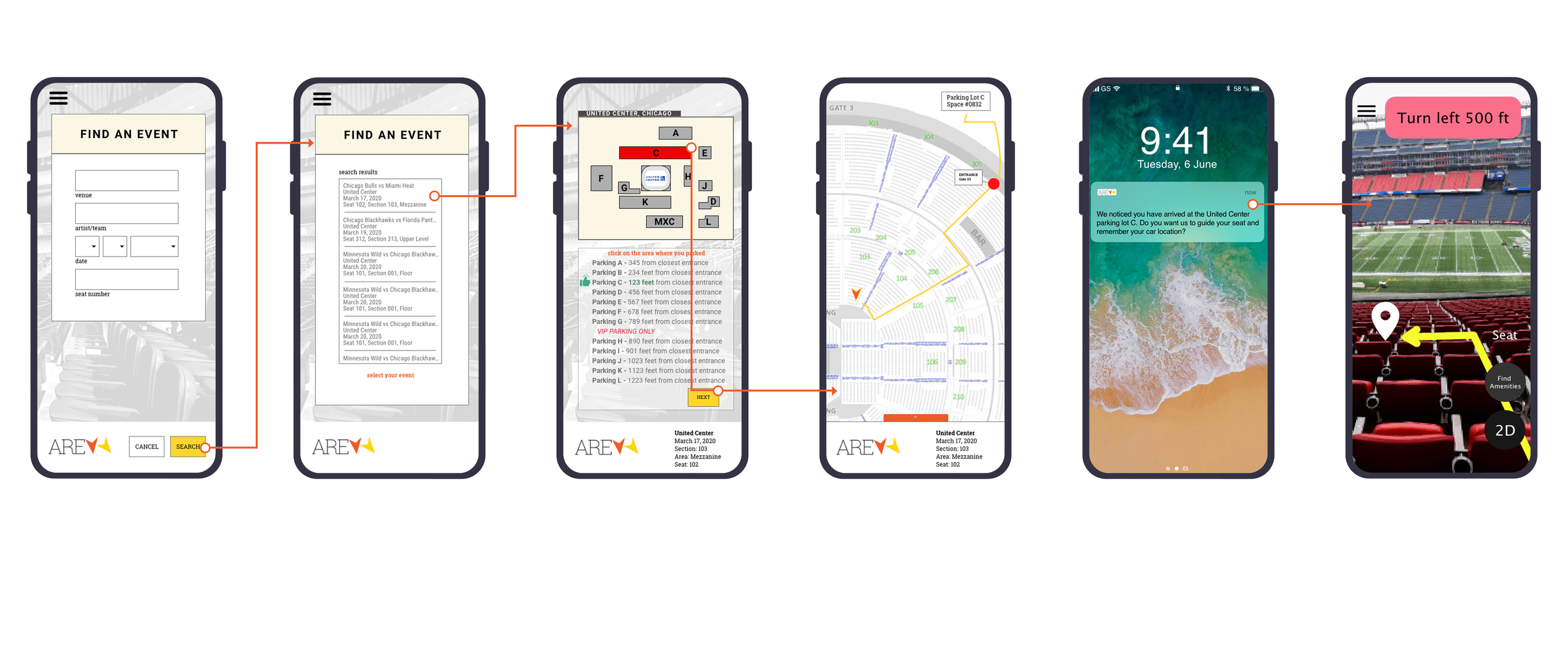
Mid-Fidelity Prototype
Created a rough prototype in Adobe XD that we could test with users so we can uncover potential issues with our initial design. We each split into groups of two and took a task that we wanted to test and created screens for that given task.
Usability Test
We gave each participant two tasks to complete and watched them go through them as we took notes of what they were doing. We did each task on their own and recorded things like errors made, time spent on completion, and overall comments or remarks. We tested with four participants, two male and two females. Their ages ranged from 24-39 so they were a fairly young group we did testing with. It should also be noted that everyone we tested with is on the record saying they have over ten years’ experience using a mobile phone.
Usability Test Results Analysis
By analyzed the test results our team came up with five main things that we needed to fix. These five things are the following:
Edit the content on the homepage since all four users had different ideas of what belongs there and what doesn’t.
The banners that show bathrooms and concessions were not clickable themselves, just the pinpoints next to them were. We need to make both clickable for users.
Make the tab that slides out more prominent on the screen and easier for users to see and find. They said that they had a hard time finding it sometimes.
Add more things like breadcrumbs and back buttons so users can go back to where they previously were without having to go all the way back to the home screen if they want to cancel an interaction.